The page had one goal: to reduce potential clients’ doubts and turn visitors into real inquiries.
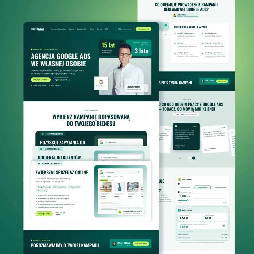
The client wrote the copy, and we supported them at that stage. We asked questions and looked for answers to their customers’ most common concerns. That is why we started with the user journey: from a headline with a promise, through the scope of services and the collaboration process, to the contact form.
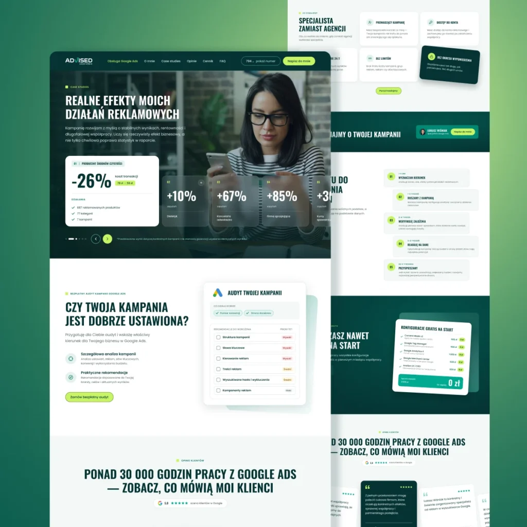
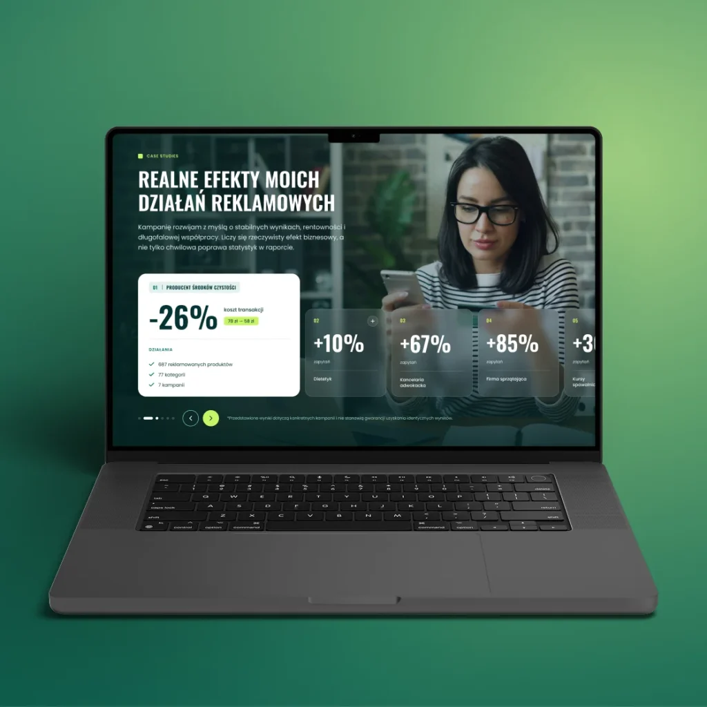
Each section of the page addresses one of those concerns. Real case studies show results, and client reviews build trust. The section on experience and a publicly available price list make the decision to get in touch easier.
We created the design in Figma. We went for a simple layout, a clear heading hierarchy and recurring CTA buttons. This way, visitors always know the next step, wherever they are on the page. We also took care of the mobile version.
An SEM agency knows better than anyone that campaign performance depends on the page a customer lands on. That is why we planned a logical heading structure and short blocks of text that make the page easy to scan from the start.
We handed over the finished desktop and mobile design to the client’s developer. As a result, every element of the page has one job: to remove a doubt and bring the visitor closer to getting in touch.
Planning a landing page for your business? See our website design.