In many companies, presentations are created every day: sales proposals, quarterly reports, campaign summaries, presentations to the board of directors or pitch decks. The problem begins, however, when each department creates them „in its own way.”.
The result? Inconsistent colors, different fonts, logos in a different place on each slide and charts that have nothing to do with the brand's visual identity. We know this well from our daily work - sometimes we get presentations from different departments of one company to redo, and they both look completely different.
The solution is a professionally prepared PowerPoint presentation template - a slide system that organizes communications and allows teams to create aesthetically pleasing, cohesive presentations without knowing a brand's specific guidelines. However, to truly fulfill its role, it must be well designed. So what should you pay attention to?
What is a PowerPoint presentation template?
A template is a set of blank, ready-made slide layouts designed in accordance with a company's corporate identity. It is not a single presentation, but a foundation that allows you to quickly build further materials - based on:
- defined color palette,
- established fonts,
- fixed logo placement,
- ready-made content layouts,
- Consistent chart and table styles.
As a result, even people who are unfamiliar with corporate guidelines are able to prepare a professional presentation in line with the brand.
1. the company's color palette
The foundation of any professional template is a clearly defined corporate color palette. A well-crafted template allows you to create charts and diagrams in your brand colors with a single click - without manually adjusting or typing in your corporate color numbers from scratch every time.
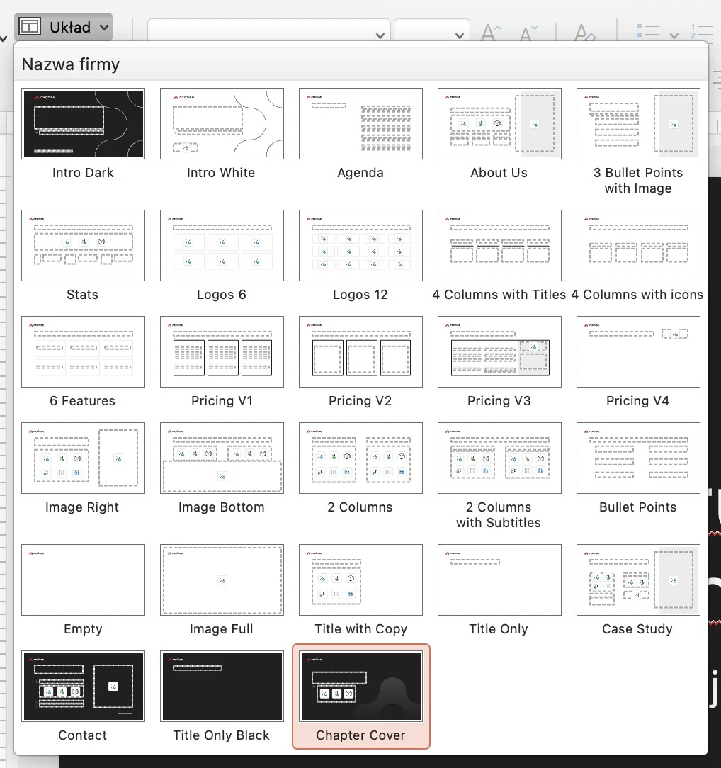
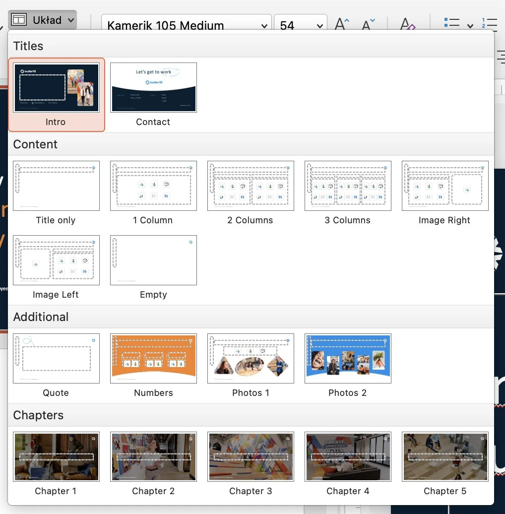
2. a minimum of 20-30 ready-made slide layouts
A professional template is not 5 basic layouts. It is a well-thought-out system that realistically supports the daily work of marketing and sales teams and addresses the most important needs. A good practice is to prepare at least 20-30 different layouts, such as:
- Title slide (several variations),
- section divider,
- A slide with one large headline,
- 2 columns (text + text or text + graphics),
- 3 and 4 columns,
- A slide with a bullet point, quote, chart or table,
- step-by-step process,
- case study,
- summary and contact slide.
It is also a good idea to prepare dark versions of key slides - they increase the dynamics of the presentation and improve readability during live speeches. The more flexible the template, the lower the risk that someone will start creating „custom solutions.”.
3. defined company fonts
Typography is one of the most often ignored elements of consistency. A good template should have:
- defined header and text font,
- established hierarchy of size,
- finished list styles.
This ensures that when you add a new text field, the correct font is automatically applied. No manual changes, no chaos, and no Arial in the middle of a premium presentation.
4 Fixed positioning of the logo
The logo should not be a „moving” element. In a professional template, it is embedded in the Master Slide - always in the same place, in the right size and with a protective field. This is a small detail that significantly affects the perception of the brand, especially in B2B communications.
5. instructions for using the template
Even the best-designed template requires a short implementation of the team. Therefore, already at the stage of handing over the file, it is worth ensuring that clear guidelines are in place to facilitate daily work with the presentation. This is especially important for those who do not work in PowerPoint or Google Slides on a daily basis, yet are responsible for creating sales, marketing or reporting materials.
The manual should include such elements as:
- How to choose appropriate slide layouts,
- How to add photos in places designed for this purpose,
- How to use the company's color palette,
- How to insert charts in brand colors,
- What not to modify in the slide pattern,
- example chart,
- sample table,
- a suite of corporate icons of your choice.
These are just a few extra slides, but they realistically increase the effectiveness of the template implementation. Moreover, they significantly reduce the risk of the visual system „going awry” after a few months and allow you to maintain a professional brand image in any presentation in the long term.
A professional PowerPoint presentation template is not an aesthetic add-on - it's an operational tool that reduces presentation creation time, eliminates branding mistakes and allows teams to act faster and more confidently. In short, centralized style management means less work in the future and more control over brand communications.
If your company regularly creates presentations for clients, management or business partners, a well-designed template is a must-have. And if you need support in creating it in PowerPoint or Google Slides - you'll want to make sure it's a good one. write to us.
